
|

|

|

|

|

|

|
|
|
|
|
|
|
|
|
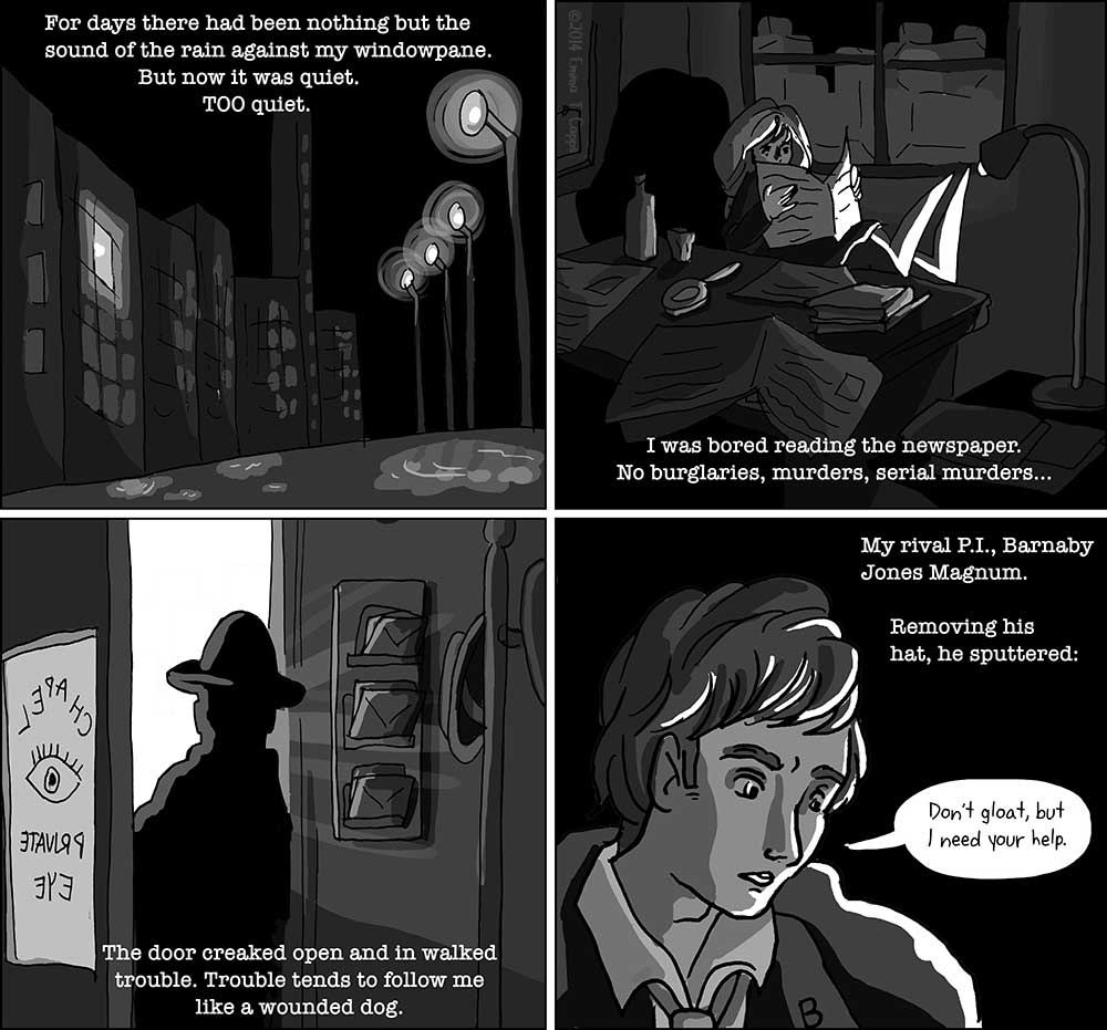
For this comic, I wanted to play with the art conventions of film noir. I referenced normal stills of film noir as well as some of the legendary black-and-white photographs of Ansel Adams to inspire the style of this comic. What’s really interesting about film noir composition & Adams’ photographs is because they ARE in black and white, they often span both extremes of contrast and include pure white and pure black in the same composition. No pastels if all you have is grayscale! Also, film noir’s stark lighting is really fun to play with.
For all this talk about the artistic merits of film noir, though, I’ve never actually SEEN any of the movies that make up the genre. Can any of you recommend me some film noir I should watch? I need to get a noir-ducation! Also, the title of this strip is an homage to Théophile Steinlen’s legendary ad illustration for the “Le Chat Noir” cabaret in Paris.
|
| ©2026 Emma T Capps | Contact Us | Terms of Use |